Orris London
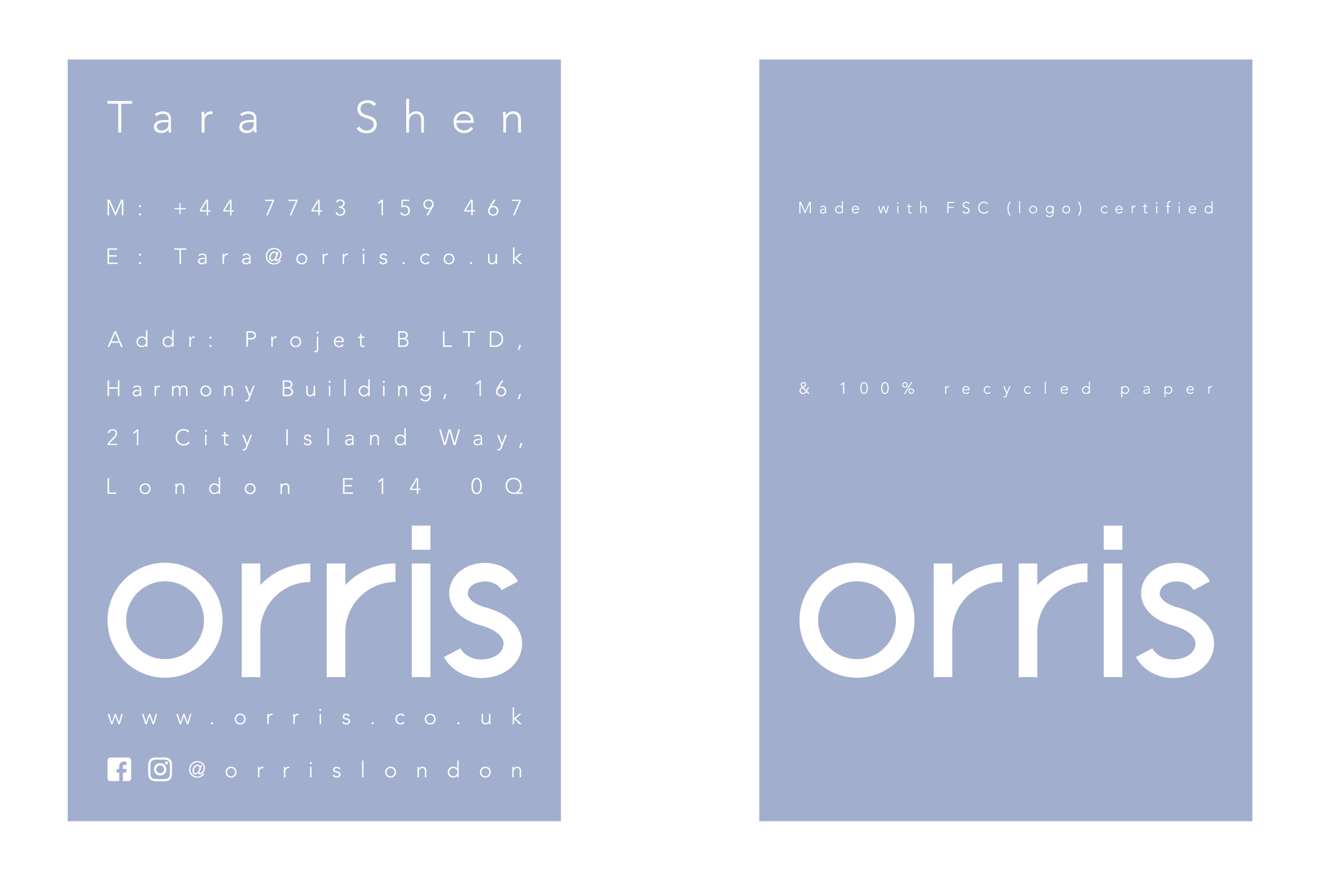
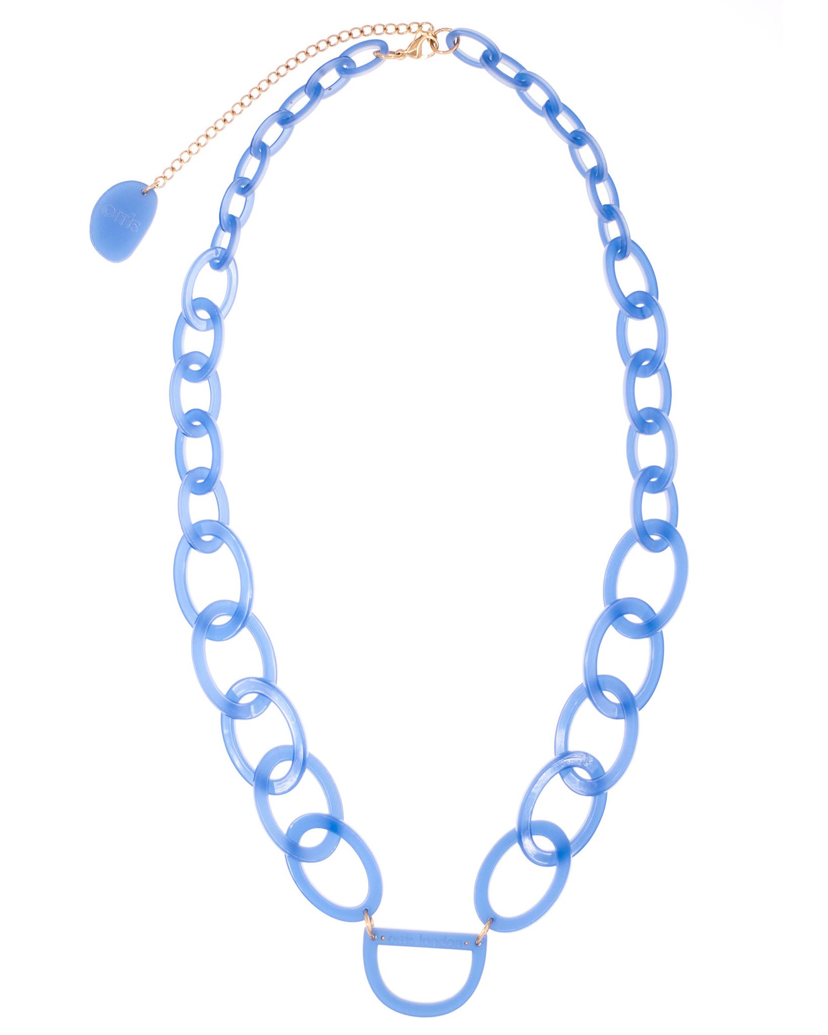
orris london是英国设计师Tara Shen的首饰品牌。销售的产品是设计师独创的新式眼镜链。品牌定位为20-40岁的独立白领女性。设计师希望通过设计改变人们对传统眼镜链的古板印象。时尚,简约,新颖。是设计师的诉求。为了达到品牌的重塑,我参观了设计师的工作室,研究了设计师产品的特点。改变了原品牌衬线字体logo,重新设计了非衬线字体的logo。帮助品牌塑造年轻与新颖的视觉特点。orris意味“鸢尾花”,在配色上我采用了鸢尾花的淡紫色作为品牌的主色调。在应用上,非衬线的新logo更便于被应用在狭窄,细小的眼镜链上。
Orris london is the jewelry brand of British designer Tara Shen. The products sold are the new glasses chain created by the designer. The brand is positioned as an independent white-collar woman between the ages of 20 and 40. Designers hope to change the old-fashioned impression of traditional eyewear chains through design. Stylish, simple and original. It is the designer's appeal. In order to reshape the brand, I visited the designer's studio and studied the characteristics of the designer's products. Changed the original brand serif font logo and redesigned the logo of the non-serif font. Help brands shape young and innovative visual features. Orris means "Iris flower". In the color scheme, I used the lavender of iris as the main color of the brand. In application, the new logo of the non-serif is easier to apply to narrow, thin eyeglass chains.
Copyright© Ning Xi 2018